Interpret your Lifecycle chart
AMPLITUDE ACADEMY
Track the Growth of Your User Base with Lifecycle
Learn to measure the change in your product’s active user base over time.
Learn Lifecycle AnalysisThis article explains how to interpret your Lifecycle analysis. Make sure you've read the previous Help Center article on setting up the Lifecycle chart before proceeding.
Note
Interpret your Lifecycle chart
The Lifecycle chart's default display is a histogram with two buckets for each of your usage intervals. The blue buckets contain active users, while the red bucket contains dormant users.
This is your Growth chart. It shows the distribution of active users and the count of dormant users for a particular day, week, or month. This allows you to see which group of users affects your active user counts the most.
All your active users fall into one of three groups: new, current, or resurrected (formerly inactive). Each of these groups is represented in the different shades of blue in the histogram's blue bar. Here's how the three active user groups are defined:
- A new user (light blue) is one who is new in Amplitude as a whole within one usage interval of whenever they performed the event. Amplitude counts that user as New for one full interval after the interval in which their first event is received. For example, if your chart uses weekly intervals, Amplitude considers a user New during Oct 1 through Oct 7 if they fired the event and were new to Amplitude during that same interval.
- A current user (medium blue) is one who logged the specified event in the current interval and also in the previous usage interval (day, week, or month). For example, Amplitude considers a user who fired the specified event during Oct 1 - Oct 7 and Oct 8 - Oct 14 a current user on October 9.
- A resurrected user (dark blue) is a user who logged the specified event in the current interval but didn't log the event in the previous interval. Importantly, a resurrected user must have logged the event at some point before the previous interval (otherwise Amplitude considers them "new"). Amplitude looks back through your historical data to determine if a user was previously active. For example, Amplitude considers a user who was active on September 30, didn't fire the event during the week of Oct 1 - Oct 7 (previous interval), but then fired it again on October 9 (current interval) a resurrected during Oct 8 - Oct 14.
You also have dormant users, represented by the red bar. A dormant user is one who didn't log the event you've specified, but who had logged the specified event during the previous time period (day, week, or month). For example, Amplitude considers a user who was active on January 1st but wasn't active on January 2nd a dormant user on January 2nd.
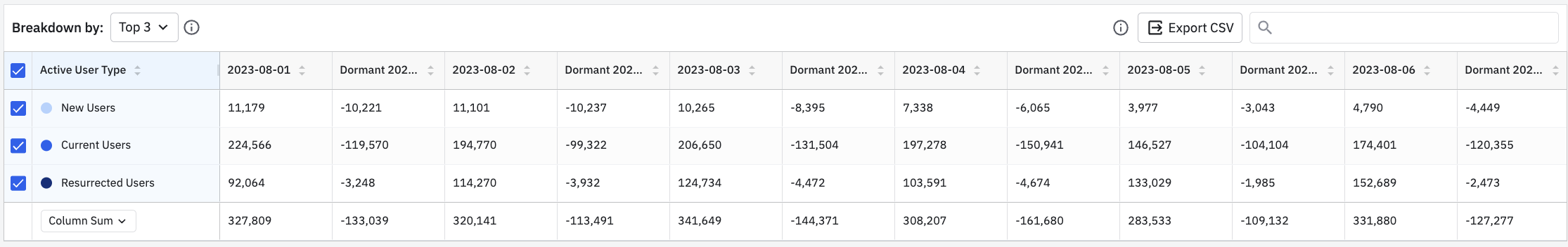
Breakdown table
Below the chart is a breakdown table of lifecycle data. You can export the data table as a .CSV file by clicking Export CSV.
Switch between views
There are also two other views for your Lifecycle chart: Dormant and Pulse.
Dormant
The Dormant chart shows the distribution of dormant users for a particular day, week, or month. For example, a dormant new user during Oct 8 - Oct 14 is a user who was new during Oct 1 - Oct 7, but became dormant on October 8.
Pulse
The Pulse chart shows the ratio of incoming (new and resurrected) users to outgoing (dormant) users for a particular day, week, or month. The ratio shows how many active users you gain for each user who goes dormant.
Specifically, Pulse uses the following formula:
(# of new users + # of resurrected users) / (# of dormant users)
Broadly speaking:
- Pulse > 1 means you're gaining users faster than you're losing them—your product is experiencing growth.
- Pulse < 1 means you're losing more users than you're gaining—and your product isn't growing.
For example, in the chart below, pulse was 0.96 during the week of Oct 8 - Oct 14. This means you lost more users in that interval than you gained or resurrected.
October 31st, 2025
Need help? Contact Support
Visit Amplitude.com
Have a look at the Amplitude Blog
Learn more at Amplitude Academy
© 2026 Amplitude, Inc. All rights reserved. Amplitude is a registered trademark of Amplitude, Inc.